Estelle Bonaceto

Estelle is a Reiki Master, published author, and consciousness coach with a deeply warm, grounded practice. But her website read like a dense text document — none of that presence made it through. We redesigned it into an elegant, editorial experience that finally feels like working with her.

Completed in 3 weeks Full Website Redesign

See the difference.

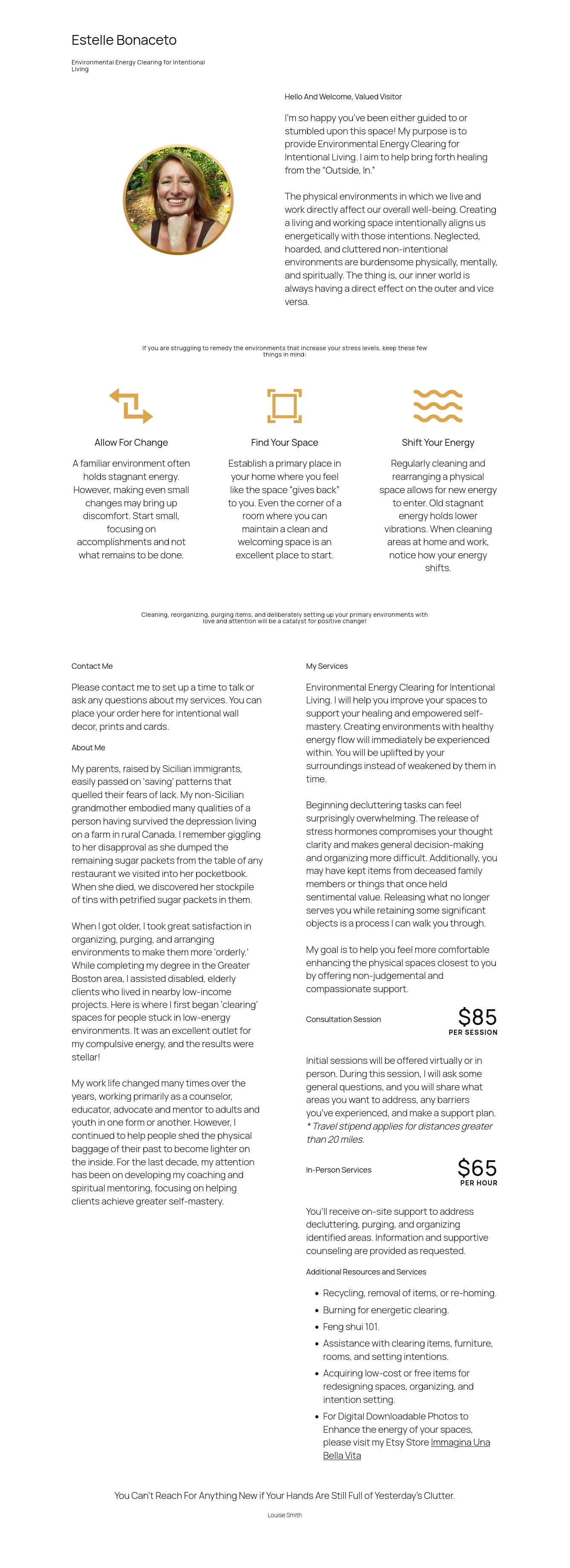
Use the handle to compare the old site with the new design. The transformation goes beyond aesthetics — it's a complete rethinking of how a consciousness coach's warmth and depth present online.

Estelle Bonaceto website after transformation
Estelle Bonaceto website before transformation
Before After Drag to compare

A warm, grounded practice hidden behind a wall of text.

Estelle has everything a client could want — genuine warmth, deep expertise, a published book, and loyal testimonials that carried real credibility. But her website presented all of it as dense, unstyled documents. Anyone who needed help had to wade through paragraphs to find a way to start. The presence she brings to her work simply wasn't reaching visitors.

A wall of text

Every page was paragraph after paragraph with no visual breaks, no images, no pull quotes. For someone already feeling overwhelmed — likely why they're seeking a coach — the density felt like more work, not relief.

No calls to action

Next steps were tiny bracketed text links like "[Work With Me]" and "[Contact Me]" buried at the bottom of long pages. On a page literally called "Work With Me," the CTA should be impossible to miss — here it was easy to overlook entirely.

No brand identity

A default white layout with brown text and out-of-the-box web-blue links. No cohesive palette, no typographic hierarchy, no visual point of view. It read like a hobbyist's blog, not a professional practice.

Just documents, not an experience

Sections were stacked in a single narrow column. The warmth visible in Estelle's photo and audible in her best lines never carried into the design. Visitors processed information instead of feeling a connection.

Mixed-up information

Book reviews were folded into the coaching testimonials page, so visitors couldn't tell which feedback was about her practice and which was about her writing.

Accessibility that had room to grow

Thin gold text on white could blur on bright screens or for visitors with less acute vision. We wanted the elegant accents to be legible for everyone, so we refined the contrast to meet WCAG standards.

A website built to feel like working with Estelle.

Every decision served one goal: let the visitor feel what working with her would actually be like — contemplative, intentional, grounded. We rebuilt the site as an invitation rather than a brochure, letting the content breathe and guiding visitors from first impression to a clear next step.

A refined brand identity

Deep plum and gold — sacred, grounding, warm without being "woo-woo." An elegant serif for headings paired with a clean sans-serif for body copy. The palette of a published author and master coach, not a generic template.

Clear, poetic value proposition

"A return to alignment. A remembrance of your sacred power." Poetic but clear — it tells visitors exactly what this is about. Supporting lines like "My work is not about fixing you... it is about guiding you back into a conscious relationship with yourself" land hard, in the best way.

Credibility that's easy to see

The book and journal are presented with the actual cover image in a two-column layout. Testimonials from licensed therapists (LMHC) and professionals are built into beautiful cards. "Literary Endeavors" separates book reviews from coaching feedback. Trust is no longer buried in text.

Estelle front and center

A large, warm photo of Estelle now leads the About page — a page that previously had zero visual elements. "Energetic alchemy as a way of life" captures who she is in six words. The personal connection visitors need is now visible.

Impossible-to-miss conversion path

The bracketed text links are gone. Solid buttons — "Begin the Conversation," "Work With Me" — now close every natural reading section. The "Invitation" section breaks the next step into three clear parts (01 Reach Out, 02 The Conversation, 03 The Container). Pricing ($100, free consultation) is right there, not buried.

Spaces that let the work breathe

Alternating white, deep purple, and gold bands create a visual rhythm that guides the eye down each page. Off-white and dark space give content room. Photoshop's offset stylistic borders anchor imagery. Sections are organized into scannable grids and numbered steps instead of endless paragraphs.

Every decision served one goal: let her presence show.

The old site read like a dense text document. We rebuilt it into a strategic, conversion-optimized experience that finally matches the depth and warmth of Estelle's practice.

Brand & Color System
The visual identity that was missing

The gap: No defined brand colors — brown text, default web-blue links, generic white background. It looked like a hobbyist's blog, not a professional practice.

What we did: A strict strategic palette: deep plum for wisdom and introspection, gold for warmth and the sacred. Editorial typography — elegant serif headings with clean sans-serif body. Warm but not woo-woo, spiritual but grounded.

Layout & Pacing
Breaking out of the single-column text trap

The gap: Every page was a single narrow column of paragraphs running down the center, with massive empty space on desktop and no pacing.

What we did: A modular grid system with color-blocked horizontal bands (white → purple → gold) that create visual rhythm and pause the scroll. Two-column image/text blocks, four-column grids for modalities, offset borders on images. Content now breathes.

Calls to Action
From missed links to impossible-to-miss buttons

The gap: Next steps were small bracketed text links — "[Work With Me]," "[Contact Me]" — easy to overlook and not visually inviting action.

What we did: Replaced every text link with solid, styled buttons ("Begin the Conversation," "Work With Me") placed at the end of natural reading sections. Visitors always know what to do next. This was the single biggest conversion win.

Information Architecture
Clear structure that guides the journey

The gap: Book reviews were mixed into the coaching testimonials page, confusing which was which. Distinct offerings blurred together.

What we did: Separated offerings with a dedicated dark-purple "Literary Endeavors" band for the book feedback, distinct from the coaching cards. Each offering is now clearly its own thing. No extra clicks, no confusion.

The Invitation Journey
Removing the mystery of how to start

The gap: New visitors didn't know what happened after they reached out. The "Work With Me" page had pricing and details buried near the bottom, and the path forward was unclear.

What we did: Built an "Invitation" section breaking the next step into three clear parts (01 Reach Out, 02 The Conversation, 03 The Container). Pricing ($100, free 30-min consultation) is right there. Visitors are far more likely to book when they know exactly what happens next.

Typography & Hierarchy
Making the language readable and editorial

The gap: A single sans-serif font throughout made it hard to distinguish page titles, section headers, and body text. The copy was strong but unreadable at a glance.

What we did: Introduced a high-contrast serif for headings (authority and publishing) with a clean sans-serif for body. Editorial "kickers" — small, all-caps colored labels like THE JOURNEY and WHAT WE EXPLORE — let visitors skim and get context instantly.

Photography & Imagery
Bringing Estelle's presence into the design

The gap: The About page had zero visual elements, so its story didn't carry the warmth of the rest of the site. Estelle's photo on the home page was doing the emotional work alone.

What we did: Anchored a large, warm photo of Estelle at the top of the About page with an offset gold border. Used photography and pull quotes throughout to break up text and create emotional connection. The practice now looks as human as it is.

Home Page Storytelling
Opening with the warmth that was always there

The gap: The page opened with "Hello And Welcome, Valued Visitor" — a formal opener at odds with the warmth of the brand. A long scroll before anything actionable.

What we did: Rewrote the flow around the visitor's journey — who she is, what she believes, how you'd work together, what others have experienced, and how to start. The blog and book content was moved off the home page and given its own clear treatment. It's an invitation, not a brochure.

From text documents to a brand experience.

Before
  • Wall of text on every page
  • Tiny bracketed "[Link]" CTAs
  • No brand color or typography system
  • Single-column, document-like layout
  • Mixed-up book reviews and testimonials
  • No photo or visual breaks on About
  • Formal "Valued Visitor" opener
After
  • Content that breathes, section by section
  • Prominent "Begin the Conversation" buttons
  • Real plum & gold brand identity
  • Modular grids with color-blocked rhythm
  • Distinct "Literary Endeavors" section
  • Warm photo of Estelle leading the About page
  • Invitation-led home page, not a brochure

Your website should feel as good as your work.

Estelle has a warm, grounded practice — she just needed a website that finally showed it. If your digital presence doesn't capture the quality of what you offer, let's talk.