The Transformation
See the difference.
Use the handle to compare the old site with the new design. The transformation goes beyond aesthetics—it's a complete rethinking of how a movement presents itself to the world.
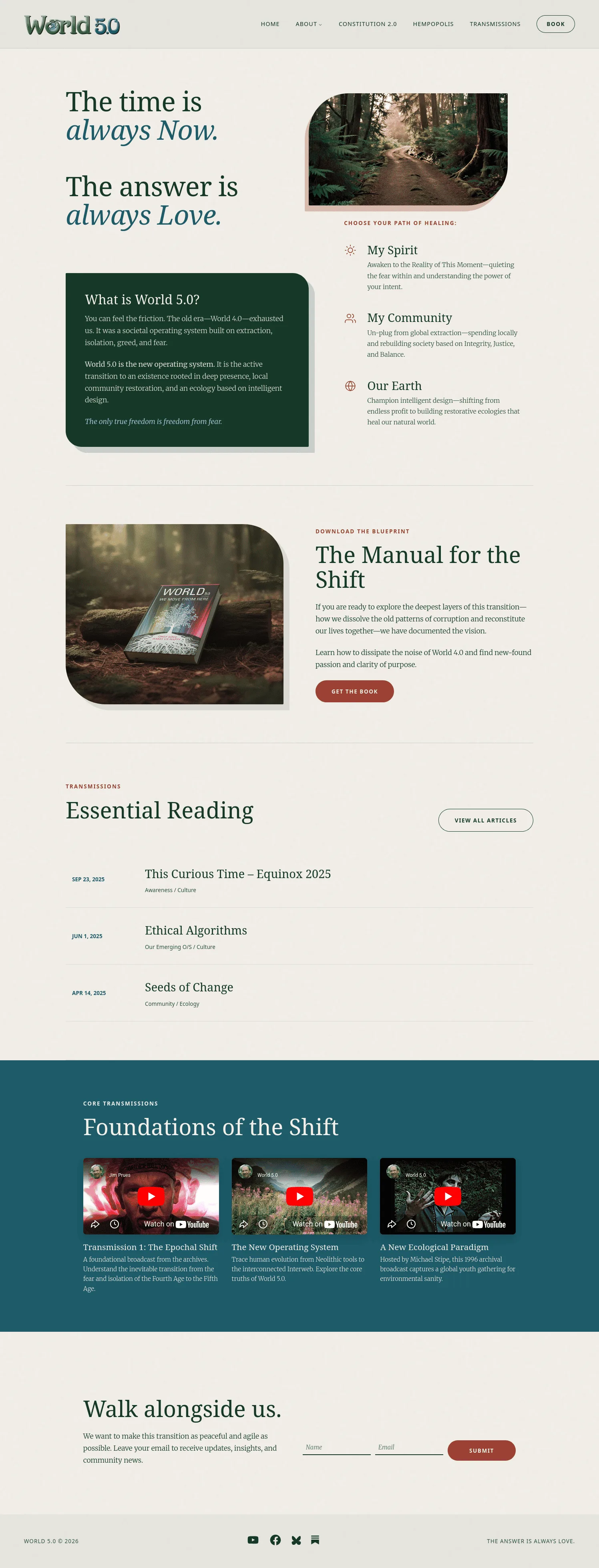
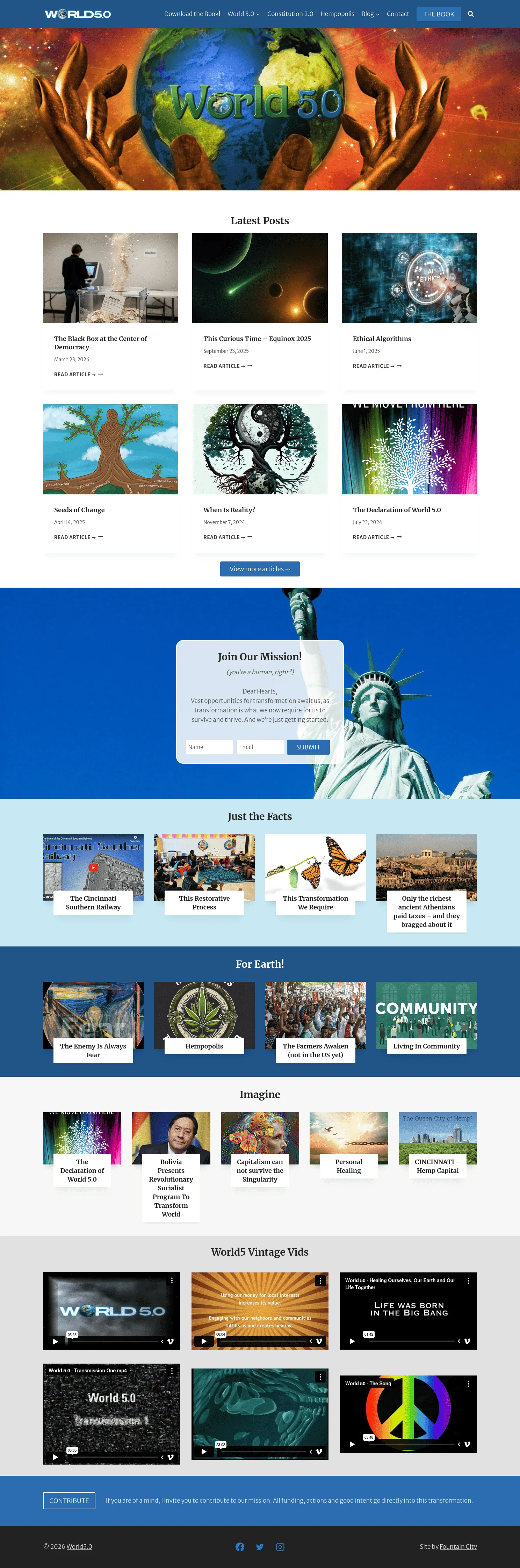
World 5.0 has a powerful mission but had a website that felt like a draft—chaotic, visually outdated, and disconnected from the depth of their message. We transformed it into an elegant, editorial platform that matches the sophistication of their movement.
Use the handle to compare the old site with the new design. The transformation goes beyond aesthetics—it's a complete rethinking of how a movement presents itself to the world.
World 5.0 is tackling humanity's biggest challenges—spiritual awakening, community building, environmental restoration. But their website felt like a personal blog from 2015, not a serious movement. Visitors were leaving before absorbing the depth of the mission.
Space-themed backgrounds, starry headers, and jarring neon colors. The visual language felt disconnected from the earthy, grounded message of the organization.
Massive blocks of text spanning the entire screen width, causing eye fatigue. Dense paragraphs without hierarchy or breathing room made visitors want to skim or leave entirely.
Disjointed color palette mixing stark whites with dark blue headers. Heavy reliance on outdated digital composites and heavily saturated stock photos that felt disconnected from the text.
Rigid rectangles with hard edges, cramped spacing, and a messy sidebar filled with categories, recent posts, and tags. No visual hierarchy to guide the user's journey.
Giant starry graphic followed by chaotic blog grid, email signup stuck in middle of graphic, random video grid at bottom. No clear path or story—everything thrown at once.
The book page had vibrant cover clashing with dark purple background. Articles felt cramped and visually boring. The site felt like a draft of an idea, not a credible movement.
We transformed World 5.0 from a chaotic, dark, digital style into a calm, light, editorial, and nature-inspired design. Every decision served one goal: make the message worthy of the mission.
Replaced neon chaos with soft cream backgrounds, deep forest greens, earthy terracotta accents, and dark charcoal text. Instantly communicates nature, grounding, and human connection.
Replaced digital art with high-quality, muted, moody photography of nature, communities, and authentic human interaction. Consistent color grading perfectly matches the earthy brand palette.
High-contrast pairing: elegant serif for headings with clean sans-serif body copy. Stylized italics add poetic touch. Optimal line lengths eliminate eye fatigue.
Generous negative space gives elements room to breathe, creating premium, calm feel. Soft curves and rounded corners replace rigid boxes. Asymmetrical layouts keep users engaged.
Homepage now tells a clear story: opens with manifesto, guides through three paths (My Spirit, My Community, Our Earth), offers the book, presents essential reading. Guides the journey instead of throwing everything at once.
Articles transformed into beautiful, magazine-like reading experience. Clean single-column list view for scanning titles and dates. Individual articles are distraction-free, letting the message shine.
The old site felt like a draft—passionate but disorganized. We rebuilt it to match the depth of the mission with a high-end, professional aesthetic that visitors would trust and engage with.
The gap: Disjointed palette mixing stark whites with dark blue headers and jarring neon imagery. Felt like a personal blog, not a movement.
What we did: Soft cream backgrounds, deep forest greens, earthy terracotta accents, dark charcoal text. High-quality muted photography of nature and communities. Consistent color grading throughout.
The gap: Standard uninspired fonts, massive walls of text spanning entire screen width, causing eye fatigue and making visitors skim or leave.
What we did: Elegant serif headings with clean sans-serif body copy. Stylized italics for poetic touch. Optimal line lengths (60-80 characters). Bullet points, styled quotes, and subheadings to break cognitive load.
The gap: Rigid rectangles with hard edges, cramped spacing, messy sidebar filled with categories and tags. No visual hierarchy to guide users.
What we did: Soft curves and rounded corners. Masterful use of negative space. Asymmetrical layouts with oversized stylized numbers (01, 02, 03) keeping users engaged without feeling repetitive.
The gap: Giant starry graphic, chaotic blog grid, email signup stuck in middle, random video grid at bottom. Overwhelming with no clear path.
What we did: Opens with clear manifesto/statement, guides through three paths (My Spirit, My Community, Our Earth), offers the book, presents essential reading in clean list format. Cohesive story from top to bottom.
The gap: Vibrant book cover clashing terribly with dark purple/black background. Felt like disparate collection of elements.
What we did: Book presented cleanly against light neutral background, making cover pop. Elegant "Buy" and "Download" buttons. Professional publisher's landing page feel.
The gap: Standard clunky WordPress template. Messy masonry grid due to varying image sizes. Individual articles visually boring and cramped.
What we did: Main blog page (elegantly titled "Transmissions") uses clean single-column list view for easy scanning. Individual articles are beautiful, distraction-free reading experience mirroring high-end digital magazine.
The gap: Generic WordPress theme couldn't deliver the editorial sophistication needed. Pre-built templates limited design possibilities.
What we did: Custom WordPress theme built from scratch. Complete control over typography, layout, spacing, and user experience. Every pixel serves the mission.
The gap: Content scattered across pages with no clear hierarchy. Visitors couldn't find what they needed or understand the three-pillar framework.
What we did: Restructured around three core paths: My Spirit, My Community, Our Earth. Clear navigation, logical content flow, easy discovery of books, articles, and movement resources.
World 5.0 has a profound mission but had a website that felt like a draft. If your digital presence doesn't match the depth of what you're building, let's talk.